The Royal Flora Ratchapreuk Garden in Chiangmai, Thailand is an amazing collection of gardens. It opened for a flower festival in November 2006, so it is very new. It is named for the Ratchapreuk Tree, Cassia fistula, also known as The Golden Shower Tree. This is the national tree and flower of Thailand. This park is very large and as I wandered through it, I came to feel as if I was wandering through a horticultural zoo. The zoo like quality was exemplified by the many gardens that were built within it to showcase different garden styles from around the world. I spent the better part of a day here and still felt like I was rushing through it. This is a place to return to again and again, to see it grow and change and to notice what was not noticed before.
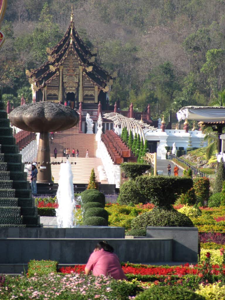
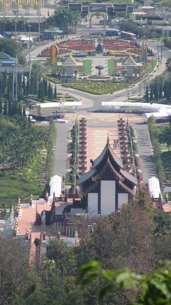
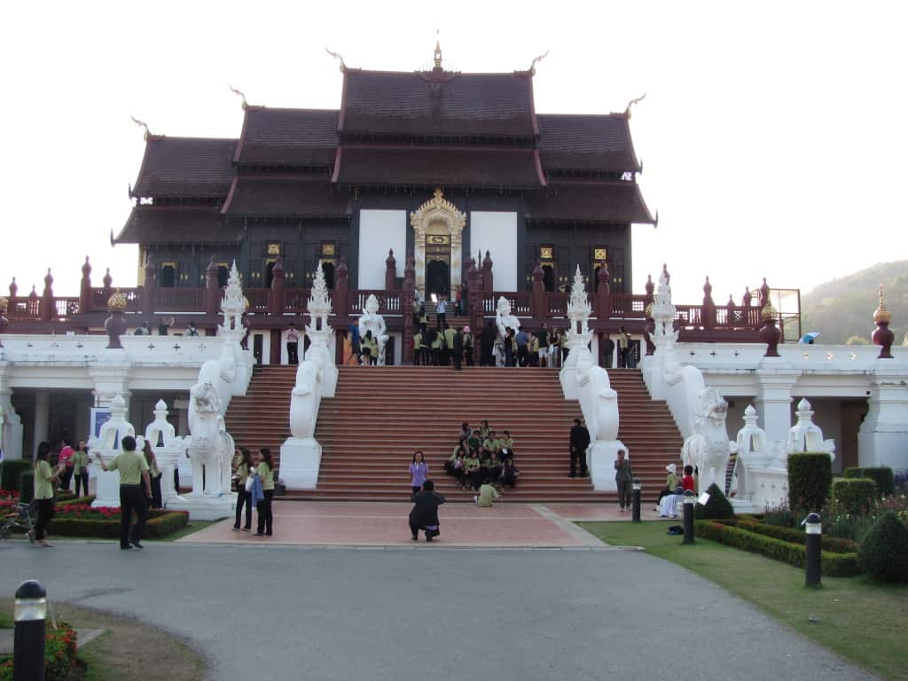
The axial lines created by the paving, plantings and ornamentation clearly draw your eye and attention to the Royal Pavilion. I was surprised by how formal the plantings were and how much topiary was used. The mountains create the backdrop for all of this visual drama and are themselves topped by Wat Phrathat Doi Kham, a place of Buddhist worship for over 1300 years.
Getting to the top of the mountain was a fun bicycle adventure, the central axial lines leading to the Royal Pavilion are clearly visible. Again the formality of the plantings stands out, and from this height the plantings in the oval have the feel of a formal Parterre garden. This is the Homage Garden, and it is filled with symbolic sculptures.
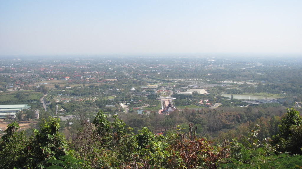
In the center of the photo, the road leading into the complex is visible, running at a different angle to the central axis line of the Royal Pavilion. I did not have time to explore the entirety of the gardens and some areas were closed. The buildings in the left foreground were part of the maintenance facilities and I believe the buildings in the right foreground were growing grounds. The gardens cover almost 200 acres. Doi Kham, while not one of the highest mountains around Chiang Mai, is a must see. It has a long history and it’s seated Buddha is amazing. The fast descent on a bicycle is the pay-off for the climb up!
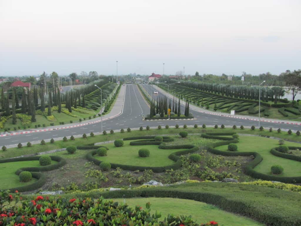
This “hill” with a road circling it disguises the transition from one central axis line to another. The formal layout and use of topiary creates a very grand entrance. The patterns created by the low hedges along the entrance appear to spell something, but from this angle I found it impossible to discern the meaning in Thai or English.
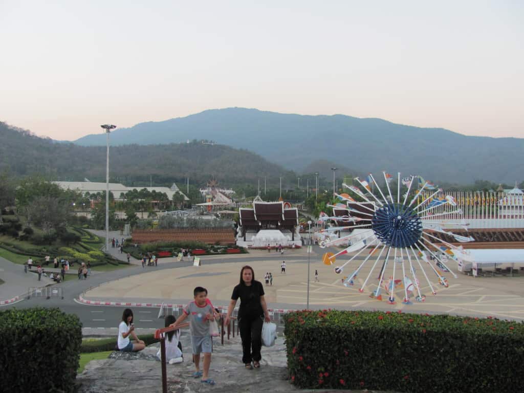
The Royal Pavilion is visible in the mid-ground and Wat Phrathat Doi Kham is on top of the peak in the background. The sculpture in the foreground is a stylized Umbrella representing the development of Thailand under the King. I’m not sure about the purpose of the large paved area in the foreground. I’m guessing that it was used for the initial International Garden Expo in 2006-2007. It was empty the day I was there.
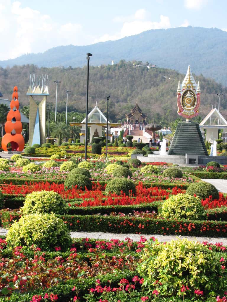
In this view of the main garden the Royal Pavilion is in the mid-ground and Doi Kham is the mountain in the background.
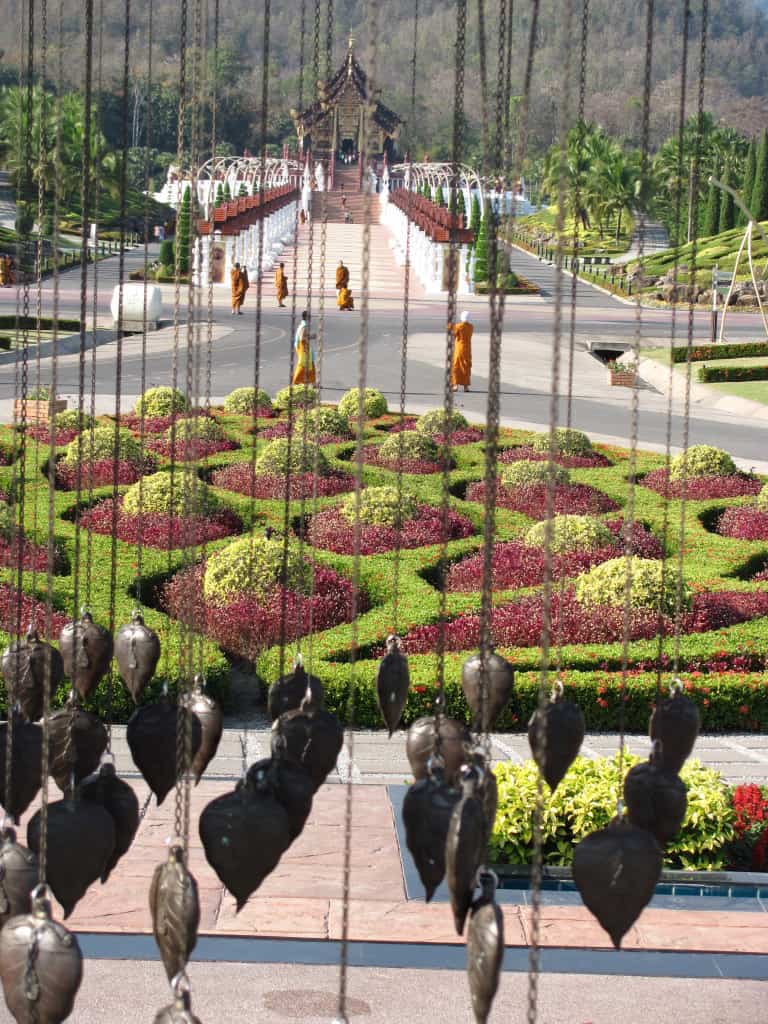
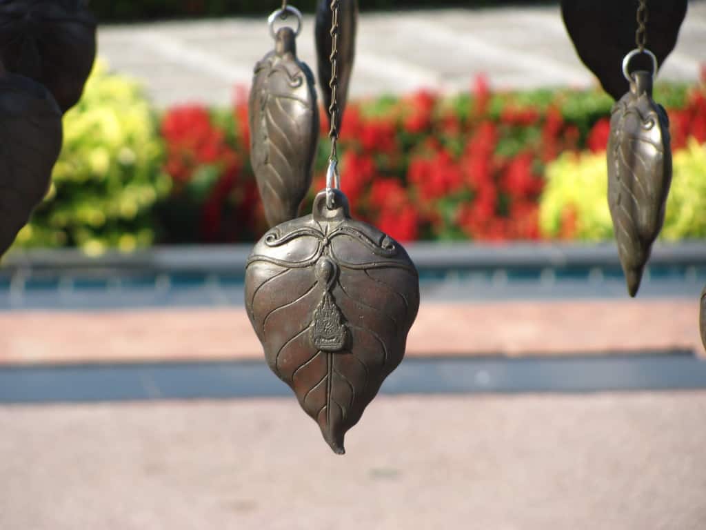
The head of the seated Buddha is visible on top of the mountain. I am standing in the middle of the Homage Garden and there is allot going on in this garden. There are vertical accents everywhere, all representing various aspects of Thai culture. However, it still feels like everything is being directed towards the Royal Pavilion and the mountain beyond. Notice the stylized cast bronze Bodi tree sculpture in the mid-ground.
I loved the feel of looking through this curtain of leaves under the Bodi tree towards the pavilion, very surreal.
It has what looks like a Wat, or temple on it, I’m not sure, there are many things in this garden that I wasn’t sure about. I would love to tour this garden with a Thai person who understood all of the symbology.
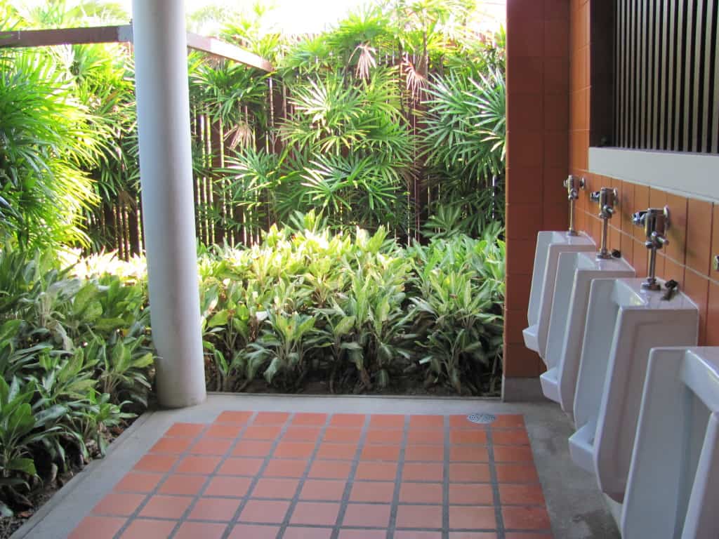
This was so cool and it made me laugh as well. Talk about a bathroom with a view. One word to learn in Thai, hongnam, bathroom!
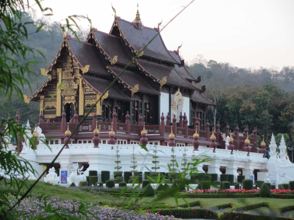
It features the Lanna style architecture of northern Thailand and seems to float over the surrounding landscape. This is a beautiful building with most of the exquisite ornamentation at the front entrance. The wood work was wonderful and I loved the attention to detail. Notice the cool color scheme, very different than the warm color scheme of a Central Thailand temple.
This was funny to watch as the Thai people politely lined up to have their pictures taken and to take the pictures of their friends and family, all with the same backdrop.
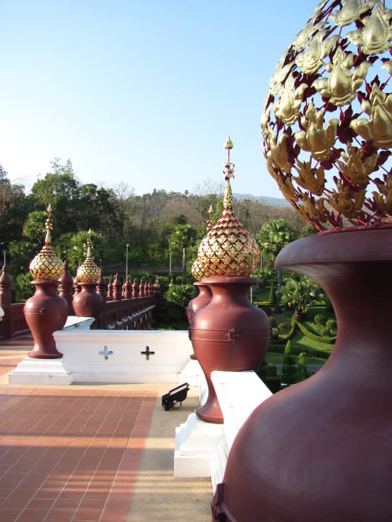
This walkway bridging the change in elevation change from the Royal Pavilion to the surrounding landscape was one of my favorite structures.
Technically not balusters or a balustrade, but these large urns with stylized crowns (?) on them evoked the feel of a balustrade. I love the linear repetition of elements typical of Thai architecture and landscapes, you see this in the ruins of very early architecture in Thailand.
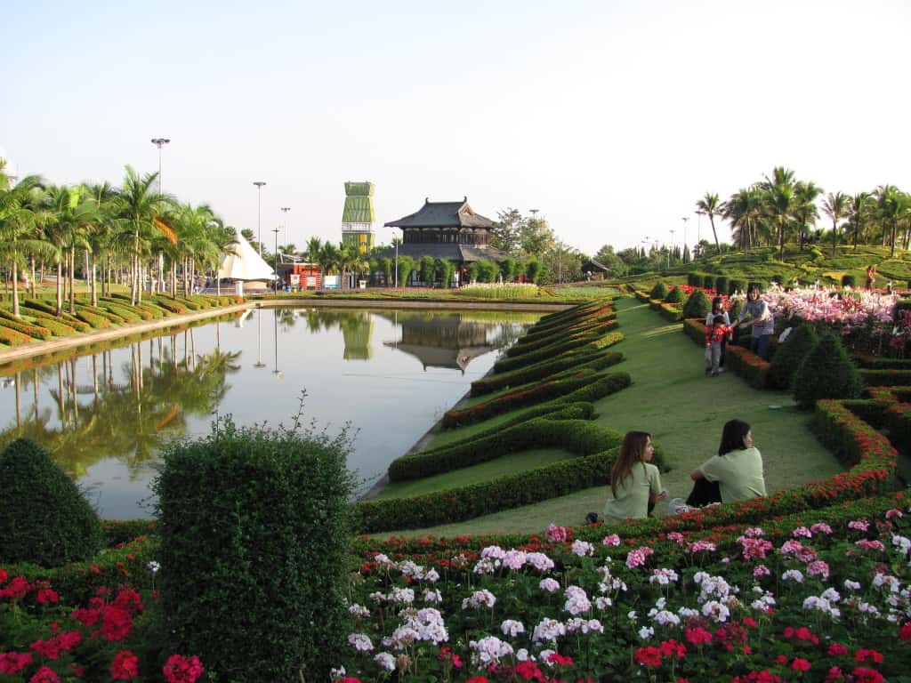
The landscape surrounding the Royal Pavilion was a mix of formal layout, carpet bedding and topiary.
I think this is Thai lettering around the pond but I can’t say for sure as I don’t recognize the font! LOL! We are moving to the tower beckoning in the distance.
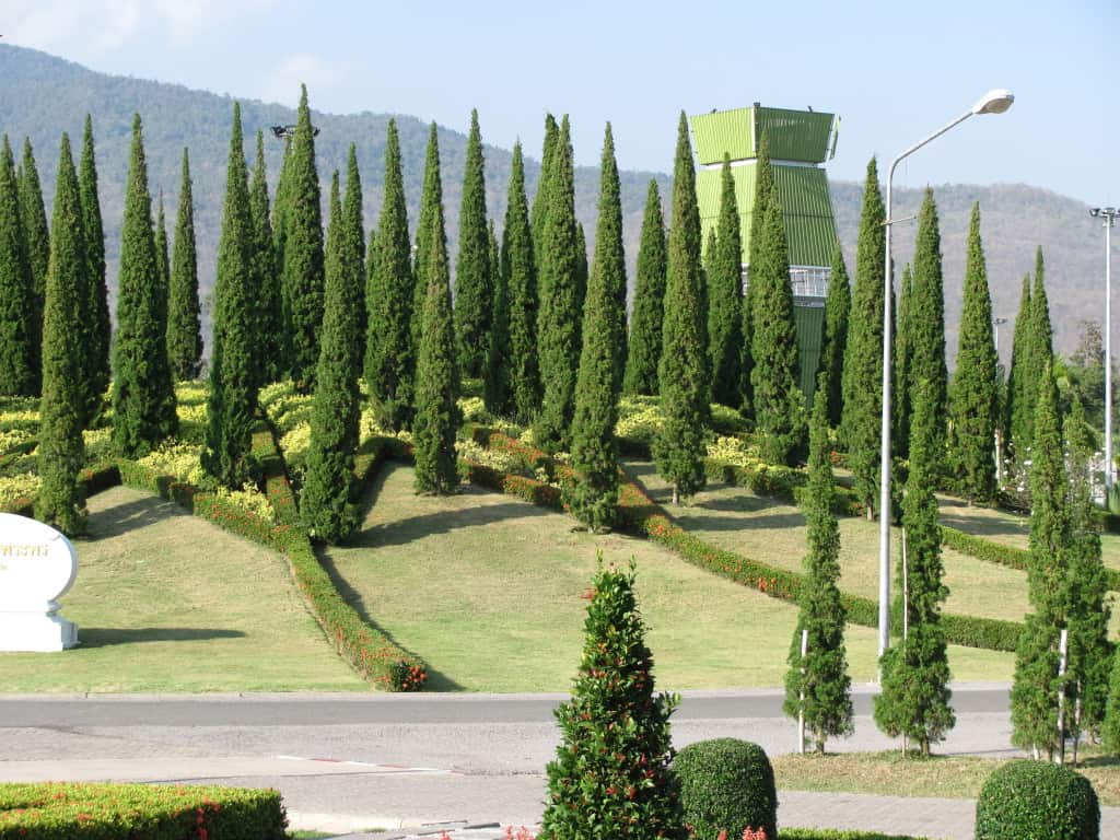
This tower wasn’t particularly beautiful, but it was a high point with a view and I simply can’t resist that anywhere I go.
The juxtaposition of the conical conifers and this structure seems jarring in this photograph, but it was balanced by an equal size planting area opposite that was framing the Royal Pavilion.
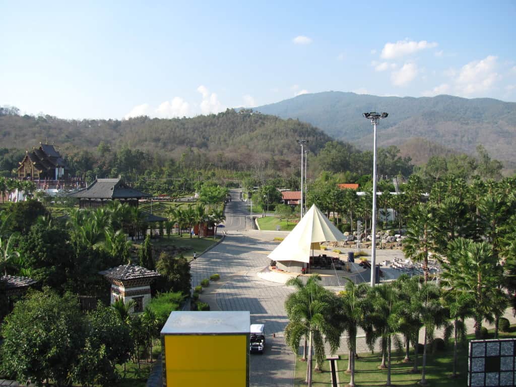
The Royal Pavilion is in the left mid-ground. The covered amphitheater below me was a surprise. I kept hearing jazz fusion music as I was walking around and it turned out to be a live band playing in the amphitheater Thailand is full of surprises and odd mixes of the new, not so new and the very old. This area in the view is the start of the gardens of the World section. Some 30 countries are represented in the gardens constructed in this area. This was my favorite part of the place and was the reason I described it as a garden with a zoo feel to it.
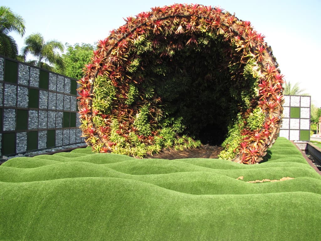
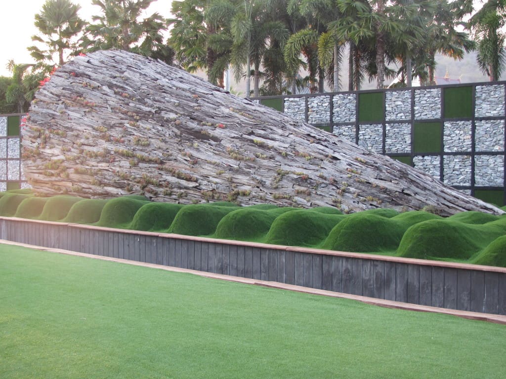
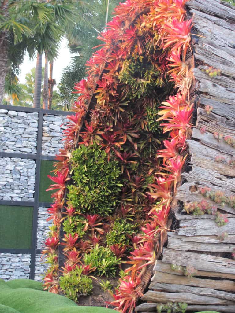
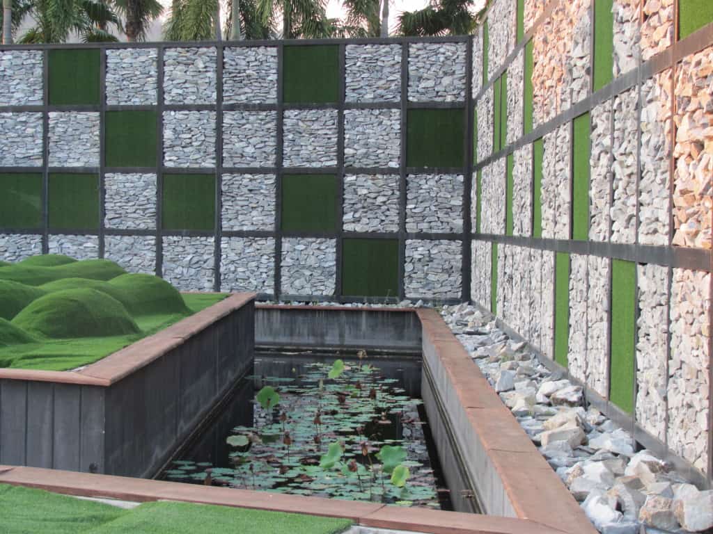
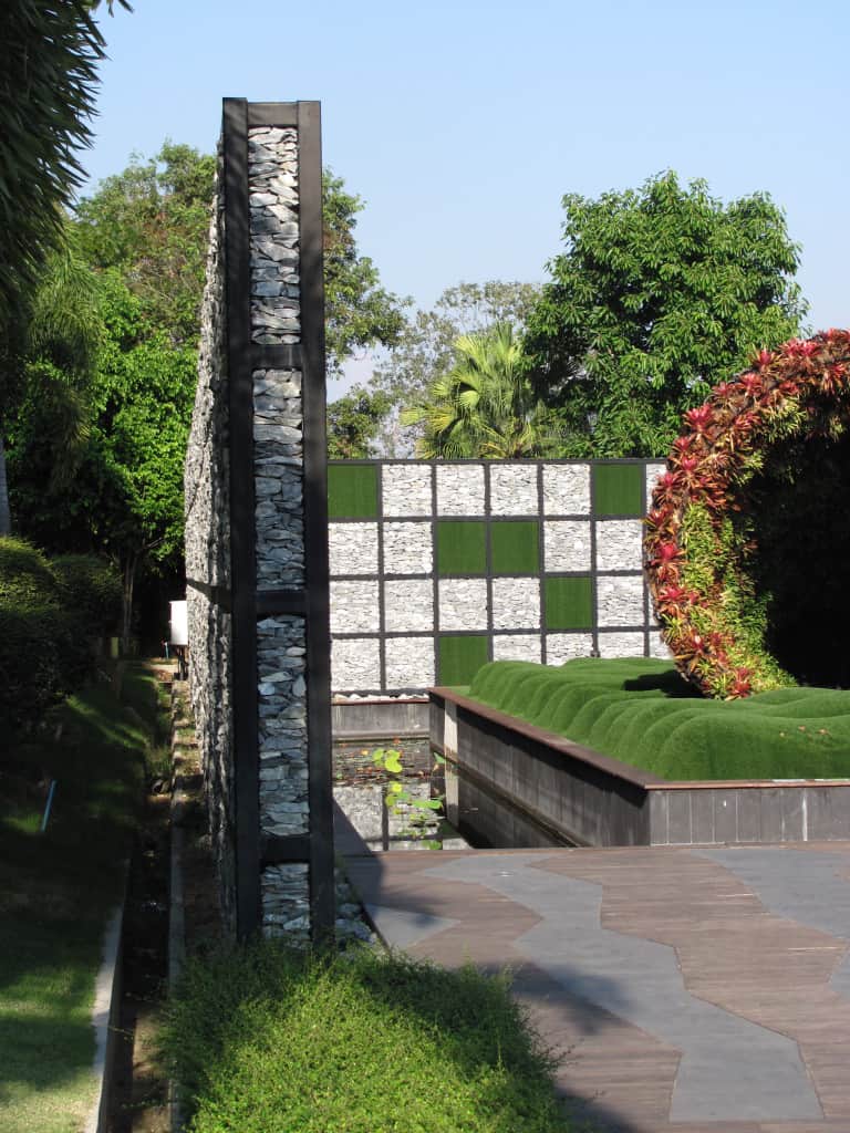
This garden was from Belgium and was absolutely startling. It resembles a cornucopia, one formed of bark and filled with Bromeliads. The floor of this structure is an undulating carpet constructed over some sort of frame work, reminiscent of clumping Zoysia grass or a Japanese Moss Garden, and the bark structure has the feel of a cave or grotto about it.
I still haven’t seen anything else like this in a garden.
I have been back to see this and it still is amazing! I suppose it is a stylized Vertical Wall garden.
I loved the contrast of color and texture and the “moat” really sets the whole thing off!
I love the paving pattern which has the feel of water moving through the patio, continuing the idea of a grotto. This design and installation is quite simply amazing as a living sculpture!
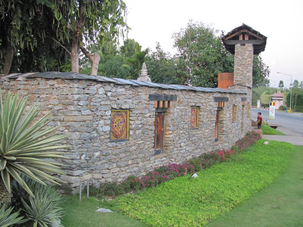
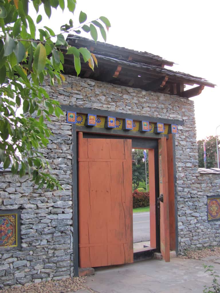
This is the garden from the Kingdom Of Bhutan and it was such a contrast to the ultra contemporary feel of the garden from Belgium.
The natural dry stack and mortar walls have an old world feel to them, like they have been here for a long time. The rough cut slate cap, the lintels over the wall openings, the coarsely carved ornamentation on the walls, combined with the slightly faded pastel colors all work extremely well together. The plantings are very simple, but they work well to lead you to the entrance.
I love that you can see the wood grain through the paint, again it feels like it has been here for centuries. The whole of the entrance has a mysterious, enchanting feel to it. What lies behind this wall? Similar to the aura that surrounds the Kingdom of Bhutan, a country in the mountains of South Asia shrouded in mystery, famous for it’s Happiness Quotient.
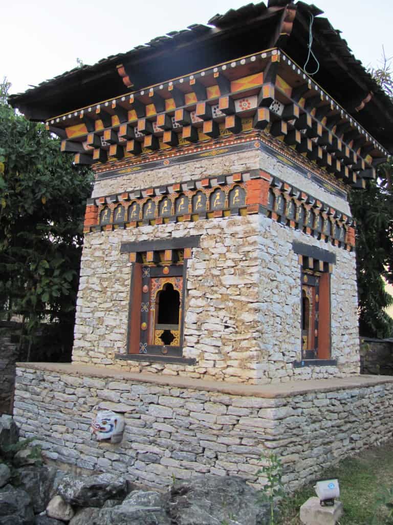
Behind the wall was a courtyard garden with trees around the perimeter, very simple plantings and paving material, gravel and these pavilions with a small water feature.
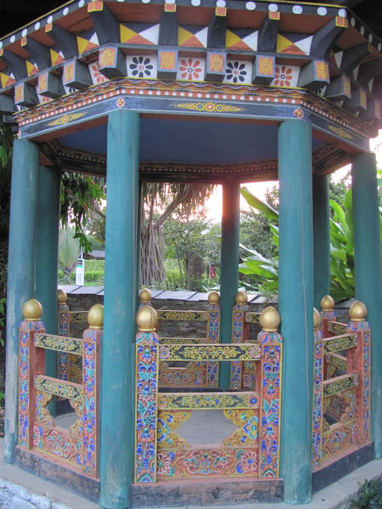
The same material from the front walls was used, dry stack rock with mortar, nicely laid corners! But here the ornamentation of the windows and the roof is much more intricate than the front walls. Notice the seated Buddhas running around the walls and the other symbols that decorate the roof structure.
This one is more like a gazebo than the other pavilions and the woodwork and painting detail is exquisite. I love the 4-chamfer cuts at the end of the beams that are painted different colors, this adds dimension and depth to the wood working. This can also be created just by painting alone. The detailing in the roof structure reminds me of Talavera Tile from Mexico. The walls surrounded this entire garden, the plantings in the background are from the next garden.
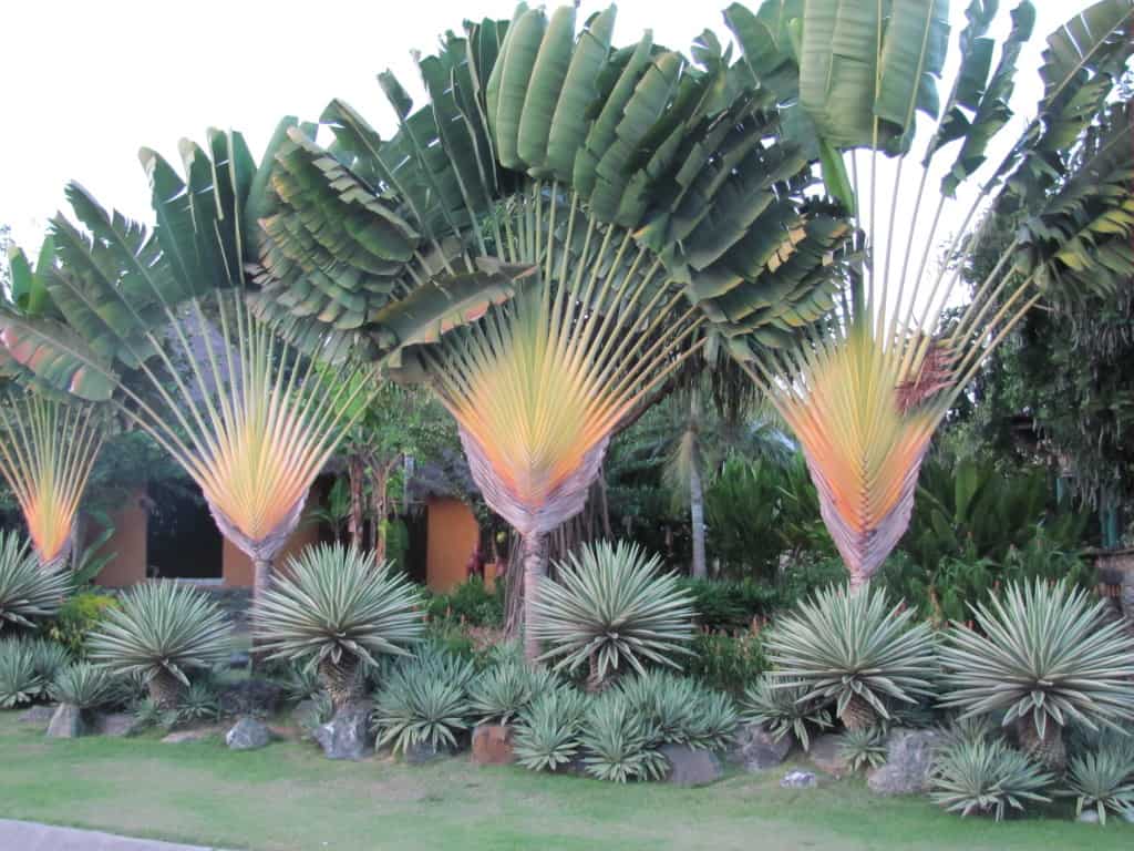
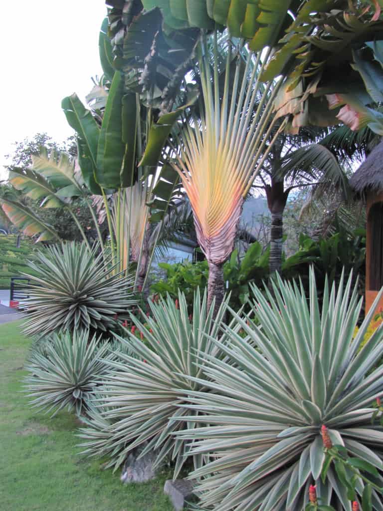
This garden was the opposite of the last garden. Here the wow factor is the contrast between textures and colors of the plant material. The bold texture of the Travelers Palm( Ravanella madagascarensis) towering over the Yucca aloifolia ‘Variegata’ and Agave angustifolia ‘Marginata’ clustered amongst the boulders stops you in your tracks.
The effect is of an informal wall. The plantings are so bold that they stop your eye from moving beyond into the interior of the garden. You don’t immediately notice the buildings behind the plantings.
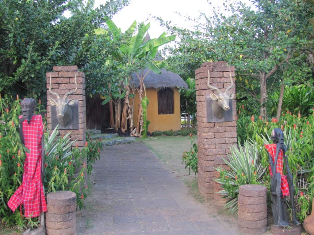
This garden is really quite subdued compared to the plantings that led up to this point. Very plain materials are used, the most striking element is the brightly robed statues. I did like the simple thatched roof house, but the interior of this garden wasn’t that interesting to me, YMMV!
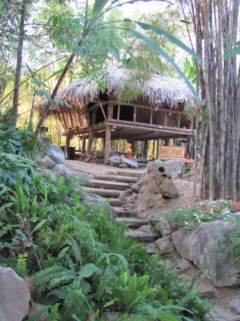
I stumbled upon this garden by just following an unmarked path, no entrance of any kind. The paving material is what caught my eye and as I followed it I came upon this structure in the middle of what felt like a rain-forest. It looks like a very old jungle house, complete with wood for cooking. I really liked the natural feel of this whole garden, as if I really was out in the wilderness. In this setting I wouldn’t be surprised to see an Elephant rambling by. What gives away it’s origin is the Thai National Flag hanging under the roof.
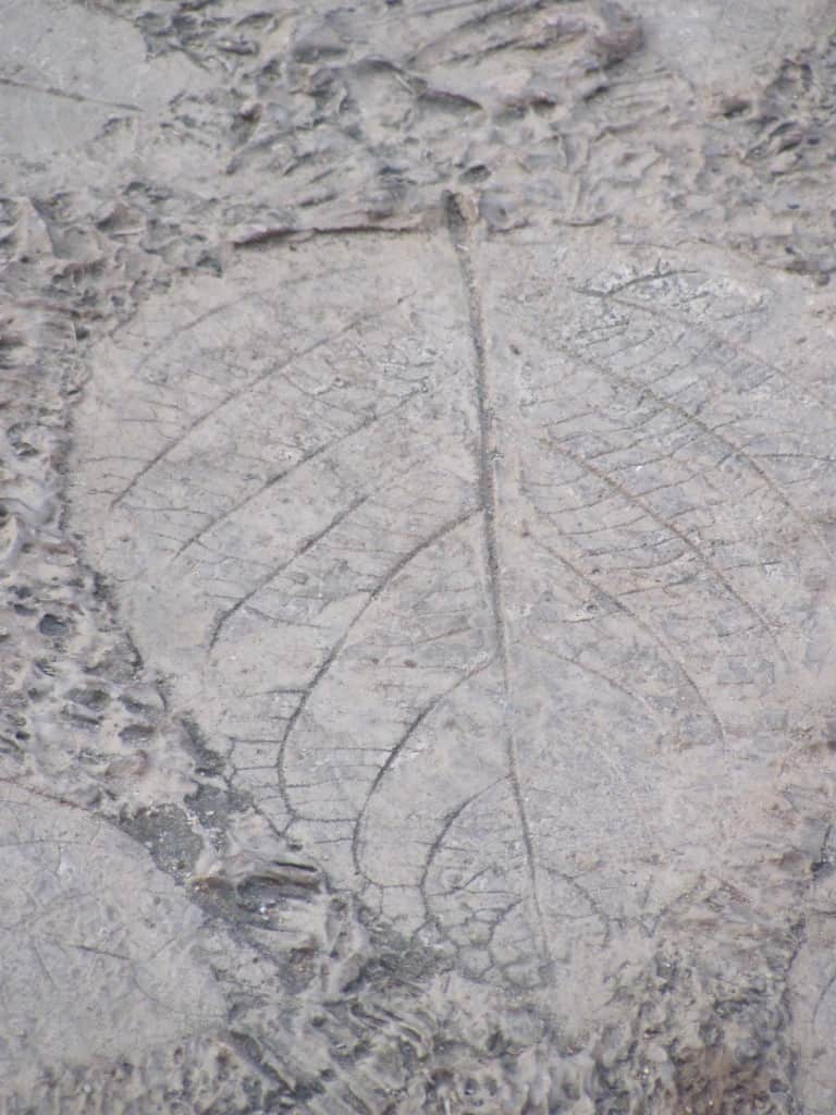
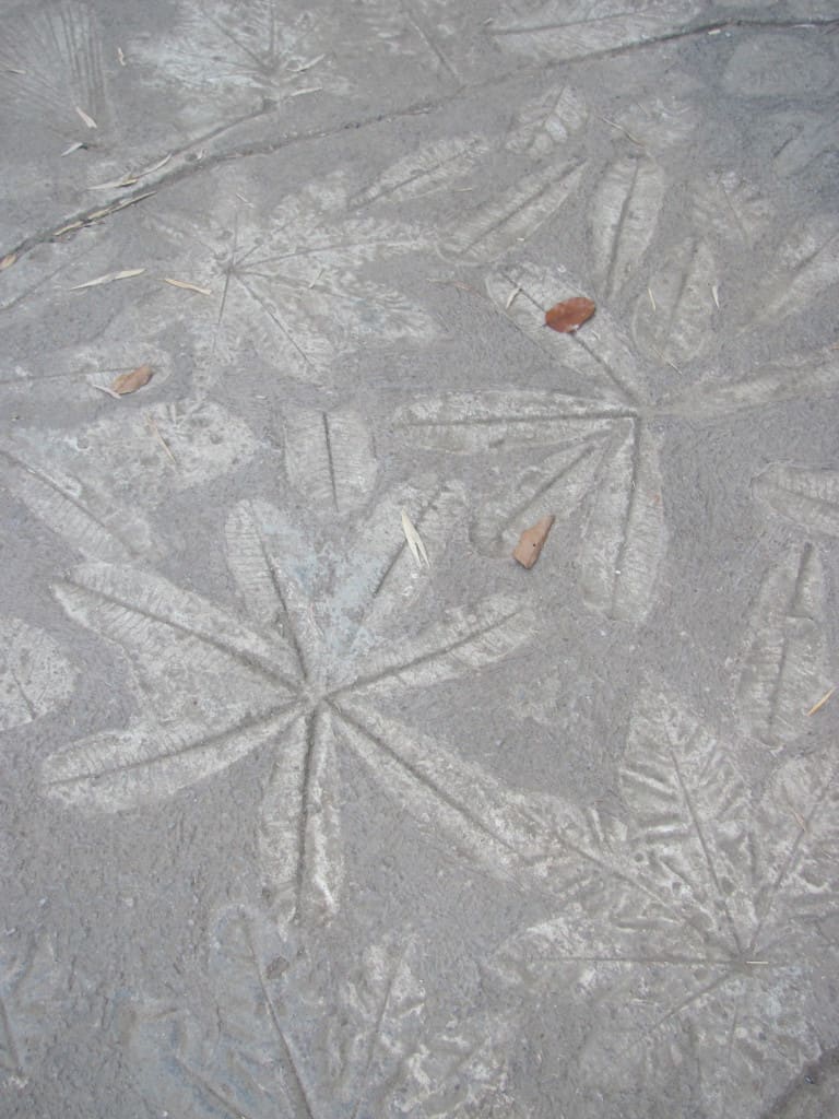
These two photographs are of the paving material in the “jungle” garden. Very clever use of leaf imprints in concrete to create this. Of course it helps if you live where there are lots of tropical plants to chose from. Something about this garden reminded me of Disneyland, or perhaps it was the opposite.
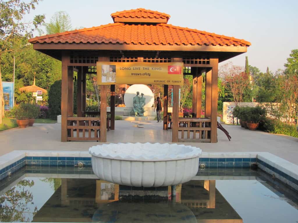
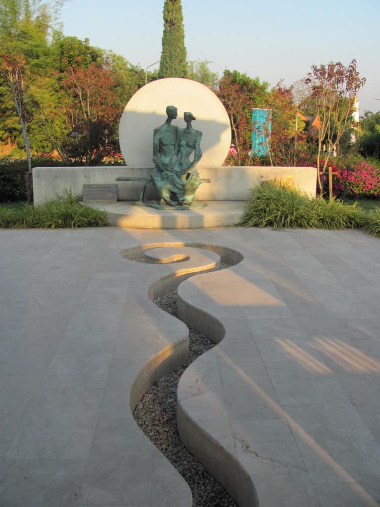
The pond was more like a reflecting pool this day. Normally this would be a fountain with jets of water shooting into the bowl in the middle with water coming from it as well. It seems no matter where you go in the world, water features are not always functioning! This garden from Turkey was all about the view of the sculpture in the background and water, or the illusion of water, directed your eye towards it.
The sensuality in this garden is wonderful, the subtle interplay of the shadows from the pavilion, the sun, or is it the moon behind the couple, all of it works together quite well. Though I really like the cut through the patio, this garden would need to have lights at night …to keep people from falling into it and spoiling the mood!
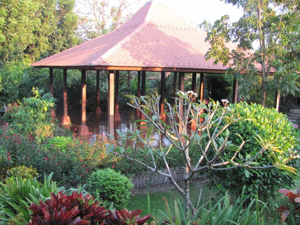
This simple design works well with the variety in the tropical plantings surrounding it. The small Plumeria tree in the foreground reminds me that a plant that I would really struggle with growing here in the San Francisco Bay Area grows anywhere in Thailand…sigh
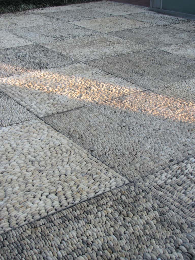
The checkerboard look achieved by turning the pebbles at opposite angles is clever. I would love to be able to do something like this for a client, but I can’t imagine what it would cost! Access to inexpensive labor makes many things possible in Thailand that would be hard to replicate here. Though I never saw anything like this in Spain, maybe the designer was inspired by Thailand.
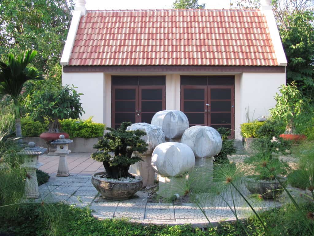
This garden is from Vietnam and I loved the patio, planted containers and the sculptural water feature.
As much as I loved it, unfortunately there is a problem with the water feature, it’s falling apart! But the ideas are great, they just need better materials or execution.
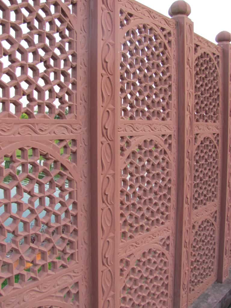
It felt like it was constructed from resin, but I liked the intricacy of the panels. It reminded me of some of the architectural detailing I saw in door and window panels in southern Portugal, influenced by the Islamic architecture of the Iberian Peninsula.
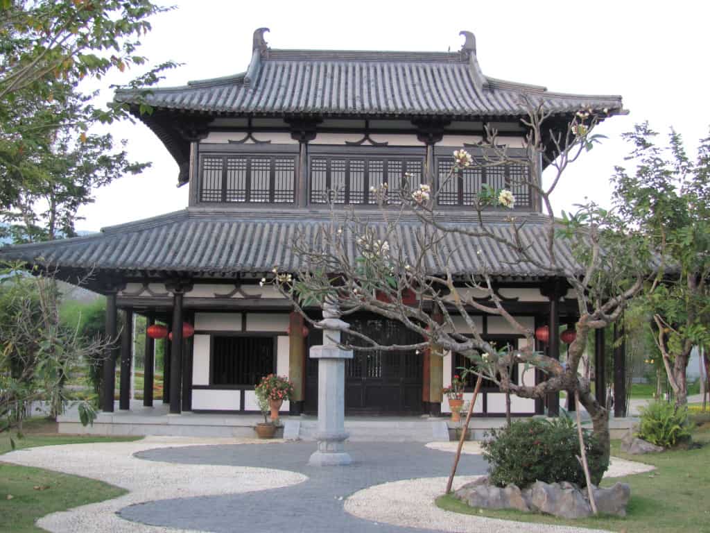
I particularly liked the roof lines and materials. But what I found most striking were the curving lines of the patio leading to the entrance. The use of two contrasting colors and dissimilar materials really accentuates the curves in the patio. There is so much more to see and explore here, time to plan for another tour of Thailand!


Follow Us!